

Internal project · RielArt
RielArt’s own digital presence.
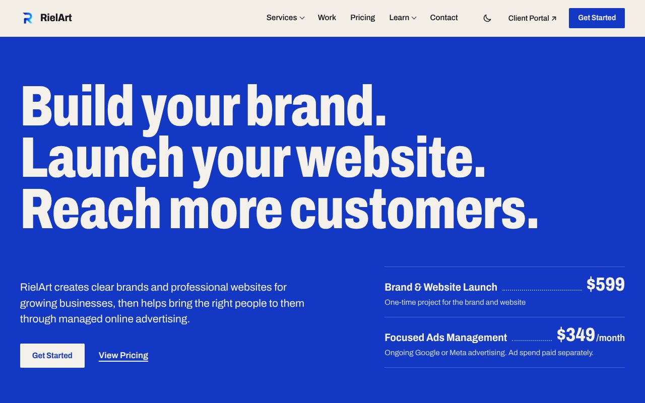
The studio’s identity, responsive website, inquiry path, and client experience are treated as one connected brand system. These screenshots show the live RielArt website design in light and dark themes.
Shown as RielArt’s own work—not as a client case study.
- Brand
- The R mark, one ultramarine ink on warm paper, and a single typeface family
- Website
- Responsive pages, light and dark themes, accessible navigation, and published pricing beside scope and limits
- Inquiry path
- One inquiry form that preselects the service, asks advertising questions only when relevant, and confirms receipt inline
- Delivery
- A separate Client Portal for approved clients’ scope, files, feedback, and updates